

Table of Contents
- Getting Started
- Designing with Figma
- 2.1 Setting up new artboards
- 2.3 Layers and groups
- Styles
- Components
Figma is a browser-based tool, hence, it is not limited to working on macOS like Sketch, it can also be operated on Windows, Linus, and Chromebook as well. Along with that, it offers a web API that too free of cost. Another astonishing feature is its real-time sharing capability on the same file, for example, if you are using an offline application like Photoshop, the designer can send the work directly using email or any messaging without exporting it to an image file.
To share a Figma file, one just needs to share a link with a colleague or clients and the file will easily open in the browser. The main advantage of this feature is that the clients can review your latest work within no time. The blog will cover the following: -
- Getting started
- Designing with Figma
- Styles
- Components
Getting Started
Starting with Figma is as simple as visiting the website www.figma.com and login or signup by entering personal details like email ID, name, etc. Once you login, clock on “New file” to get started with your project. The design of Figma is simple yet the features are very powerful justifying the old saying, “don’t judge a book by its cover”. The following options will appear once you have clicked: -
- Menu: It is a hamburger button present on the top-left corner of the screen. You can explore the options it offers or simply search for the required one.
- Tools: Tool options like shapes, frames, text, etc, are present in this part.
- Options: It contains extra options of the tool you have selected and when nothing selected, it shows the file name.
- Layers: Here you can review and proceed with your work once you are done with everything.
- Inspector: This option shows the settings or information of the selected object. There are separate tabs for prototype, design, and code.
Designing with Figma
2.1 Setting up new artboards
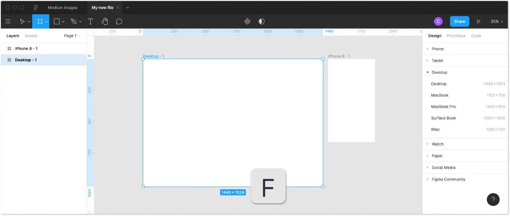
This part will be quite familiar if you had used Sketch earlier. Pressing A or F lets you see frame options on the right-hand side in the properties panel. From here, you can select the desired size for you work or create your own frame easily.
However, the difference is, in Figma you can nest the frames within each other, unlike other artboards. This will allow you to draw or create complicated designs.
2.2 Grid and layout columns
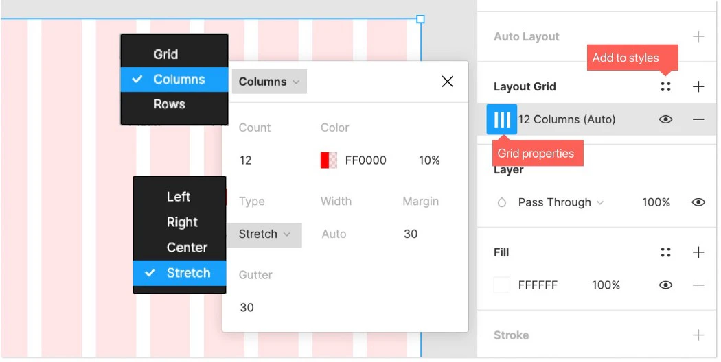
You must be aware that the grid for mobile and web design is different, hence, for a web you can use, 12-column bootstrap grid, as here spacing is less important, whereas, for mobile, you can use 8-point grid.
The grid can be adjusted from the grid properties menu present on the right hand side. In Figma, you can set up multiple grids easily that can later be stored in your styles for future use.
2.3 Layers and groups
In Figma, you find the layers panel on the left-hand side of your screen, and the following are its options.
- Layers → a layer is created automatically every time you add a new element. Through the drag and drop feature, you can rearrange the layers.
- Group layers → you can group your layers and for some, it is pivotal so that the file is manageable and neat. This will also make it easier for you to move and copy the groups across frames. An element can be selected simply by clicking cmd and the item.
- Pages → you can create pages to separate your work or make different versions of it until you get the final version. There are no rules; you can use it according to your convenience.
- Assets → this is the place where you can store your components and also the library button can be found here.
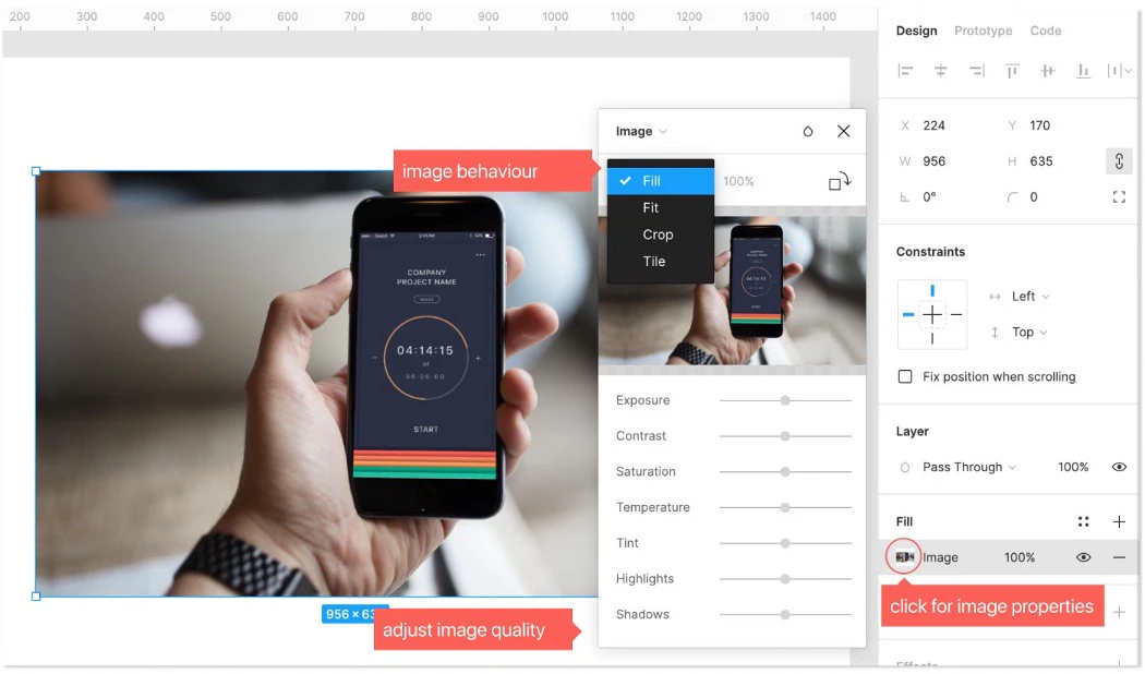
Further, you can also find options for vector shapes, images, and typography to cater your designing needs. You can find amazing google fonts in Figma as it comes preinstalled within it.
Styles
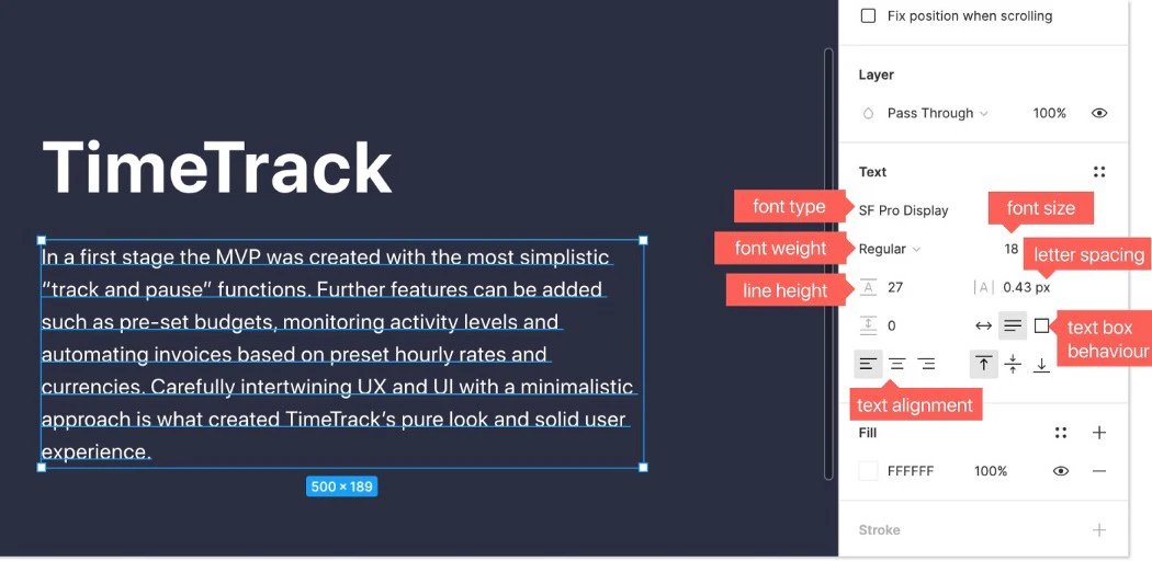
Styles used to define the colour, effect and text of the given object along with its appearance and form. It can be created to fill paint or colour, give the text its font, size, spacing and height, put effects like inner shadow or layer blur, layout the grids, and give your design the desired look so that it is appealing to the viewers.
In Figma, when you change the colour of the text, it automatically amends all the other items as well which will definitely save your time and energy. This also helps to maintain the standardization of the project.
Components
These are the elements that you can refuse while designing. With the help of this option, you can maintain consistency across your project with respect to the design. Due to this option, you will be saving a lot of time and energy.
They can be created from any layer or object that you have designed and include things like icons, buttons, layouts, etc.

There are two aspects to a Component:
- The Main Component: It defines the properties of the Component.
- Instance: It is a copy of the Component that can be reused later in any of your designs. They are already linked to the main component.
To sum it up, Figma is am amazing tool that has been occupying a large share in the market ever since its launch due to its extraordinary features to enhance your designs.


